This is a writeup from a series of talks and workshops I’ve given on this topic.
Part 1 introduced the topic, and took a look at how not estimating at all can work. Part 2 explored using data to avoid having to ask people how long they think things will take. Knowing how you can use data for forecasting is a brilliant thing to have in your toolkit, but it can be daunting to get started with. This post, part 3 of the series, will try to give you a short, practical “getting started” walkthrough to let you try this and decide if you want to learn more.
Metrics that matter
In part 2 of this series, I mentioned how useful I found Cat Swetel’s talk “The Development Metrics You Should Use (but Don’t) to help me get started. She describes many people’s experience really well: We get told metrics are important, we keep hearing “you should measure things!”, so we get the out-of the box reports that come with tools we use, and put them up in retros, and don’t really know what we’re supposed to get out of them.
There are absolutely loads of different metrics different people recommend measuring to try helping with prediction. Some are much more useful than others. I’ve found the ones recommended by Cat Swetel and Dan Vacanti are by far the most useful. These are:
- Work in progress (the number of items we’re working on at a particular time)
- Cycle time (how long it takes each of those items to get through our process)
- Throughput (how many of those items complete per unit of time)
These measures are simple to capture, easy to explain, and help you to find ways to improve how work flows through your team.
We’re often asked about how long something will take. People usually start by looking into how big, or how complex, that individual item is – but often, those measures are a surprisingly minor factor in how long it’ll take to be done. To answer, you really need to know “what else will we be doing at the same time?”
In Cat Swetel’s talk, she has a quote: “Predicting the movements of the one bee is nearly impossible without the context of the swarm of bees“. How can you learn about the swarm of bees?
And the opening section of Dan Vacanti’s book really made me stop and think about how I was approaching things:
“Amongst other things you start new work at a faster rate than you finish old work, you work on too many items at the same time, you ignore systemic dependencies and impediments, and you expedite requests that do not need to be expedited. You, in effect, initiate a denial of service attack on yourself, and then wonder why it takes so long for things to get things done.”
See your team, or collection of teams, as a system . . . work goes in, and it comes out. Understanding how work flows through it, and taking actions to smooth that flow, means you get more done overall, and “when will it be done” becomes more predictable. What’s not to like?
Getting started: Some tricky decisions
I’ve made a spreadsheet you can take a copy of and start filling in: Flow metrics. This will let you try out tracking and using these metrics, seeing how useful they seem, then deciding if you want to do more.
To get started, you only need to start recording: when each thing starts, and when it finishes. Just having a list of those is all you need to get all the stats and insights talked about later in this guide.
First tricky bit: you have to decide what you mean by a “thing”. A user story? A feature? A project? Pick one – what do you think people would be most interested in to start with?
You can use copies of this spreadsheet to track different types of item – the same metrics are useful for granular little work items (that a team finishes several of each week) and for large projects or initiatives (that various teams in a company complete a few times a year). My advice from part 2 of this series was:
- Picking items that finish often is a good idea – it’s hard to get a sense of what’s going on if you only get a new data point every 6 months (so if you’re tracking one team, doing huge big features or projects, you’ll have a long wait)
- But picking items people care about is important – if product managers, stakeholders, users all want to know about the “thing”, and you slice it into tasks that aren’t really useful on their own, tracking those tasks isn’t really helpful.
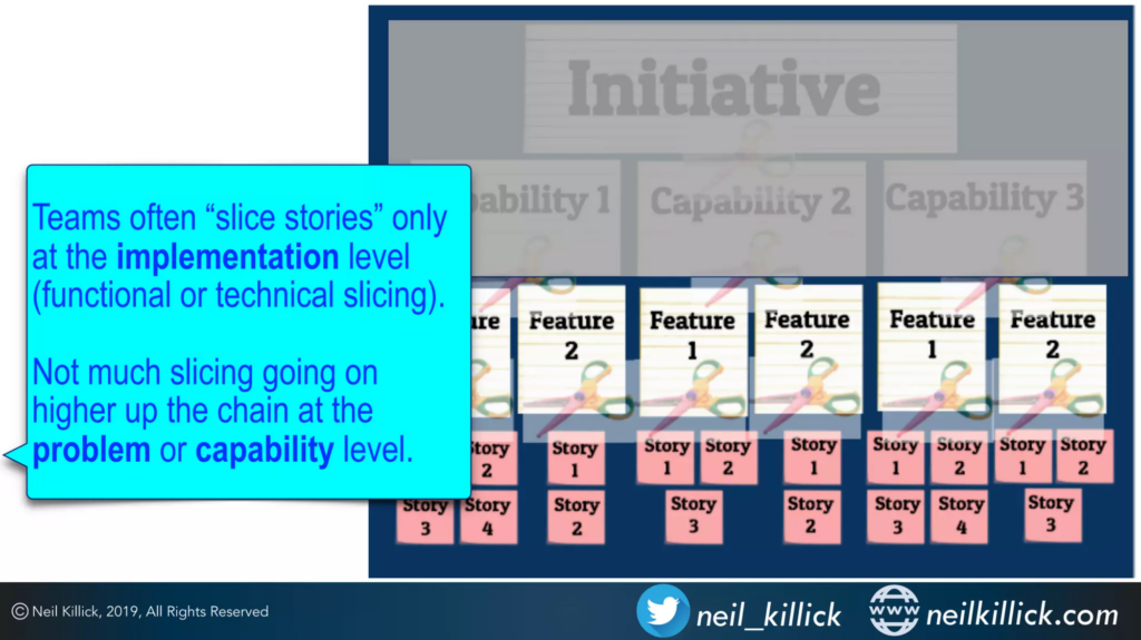
If you find your team’s only working on those big, rarely-completed “things” and aren’t sure how to slice them into smaller chunks that people would still care about, this talk on Slicing Heuristics from Neil Killick has practical ideas for moving in that direction.
Next tricky bit: You have to decide what you mean by “starts”. When it’s first discussed? When you commit to doing it? When design/analysis starts? When development begins?
There are lots of choices here, and the right answer is: whatever’s useful for you. As with deciding what you mean by a “thing” (the work items you’ll track), have a think about who you’ll discuss the team’s work with and what they care about.
Some very useful advice from Dan Vacanti: Have a clear definition of what it means for an item to be started – rather than queued in a list of possibilities, or an idea that’s going to be discussed more and decided on. In lots of organisations, frustration comes from a mismatch between stakeholder expectations (”I mentioned x, therefore it’s started … and taking ages”) and team plans (”We’re fully committed on important work for months, and will start looking into x once that’s cleared”).
For more on this, John Cutler’s article “Limit PIP (Promises In Progress)” has all kinds of suggestions for being more aware of the vague, huge pile of implied promises to do things that might be all around you.
And the last tricky bit: You have to decide what you mean by “finished”. When your team’s done their bit? When it’s live to the public? Something else?
As with all the other choices, decide what’s useful for you, and make that definition clear to everyone involved.
Capturing data
Once you’ve made those tricky decisions – and don’t worry, you can change them later – you can start recording things on the “Capturing data” tab of the spreadsheet. You can delete the example entries and start adding your own.
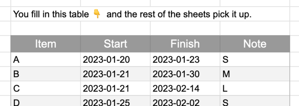
As you start each work item, enter it on this table. Give the item a reference (can be a short name, an ID or number, whatever lets you remember what it was later), and note the date it was started. When it finishes, add that date too.
There’s also a “Note” column – you can use this to tag items with any info that might be useful to dig into later. In the example entries, I’ve put a T-shirt size for each item – if you’re using those anyway, or if you’d like to try, you could do the same. Part 2 of this series described some things I found out by looking into how the sizes we gave things related to how long they took. Often, teams find that this kind of sizing isn’t as important or useful as you might think. That’s because:
- sizing is imprecise (e.g. things we predict to be ‘small’ might turn out to be much bigger)
- the time to complete items usually depends a lot more on how long they wait once they’re in progress (e.g. new items “jump the queue”, items wait for different skills in the team, questions come up that take time to answer…)
Other aspects might turn out to be much more relevant than size – you can try tagging items with the part of the system they relate to, with whether they touch the database, whether they depend on external teams … over time, as you spot patterns, you can change what you track and use that to explore the data.
Looking at cycle times
Next to the table you capture data in, you can see the “start to finish” column that automatically fills in as you put the “finish” date for each item. That’s the start-to-finish cycle time, in days, for each item. If you ask around, there are lots of different definitions of cycle time. I use the one from Dan Vacanti – on this subject and lots of others, he does a great job of looking at the options, citing advice from lots of relevant people, and making a sensible recommendation.
The cycle time we’ll use is:
- An elapsed duration (as in, not just working days, or the hours we work – we don’t “stop the clock” when doing the calculation)
- Measured between 2 points in our process – you can have lots of cycle times (between adding an item to your board to when it goes live, from when development starts to when it’s ready for testing, and many more). It doesn’t make sense to say “cycle time” without also saying which 2 points you’re talking about.
- Calculated by subtracting the end point from the start point, and adding one. Vacanti recommends this – if you’re measuring in days, and something was started on March 1st and finished on March 2nd, work was done on both those days. You might disagree and want to calculate it differently, which is fine – as long as you make that clear so you don’t confuse people!
Just looking down the column of start-to-finish cycle times is interesting – you can see the time for each item and get a sense of how much it varies. And on the “Cycle time” sheet, we can use Google Sheets’ query tool to ask all kinds of cycle time questions. On the “Cycle time” sheet, over in cell C2, a query pulls in data:
=query('Capturing data'!C25:H, "select C,H,F where C is not null")
This data’s used in summary tables:
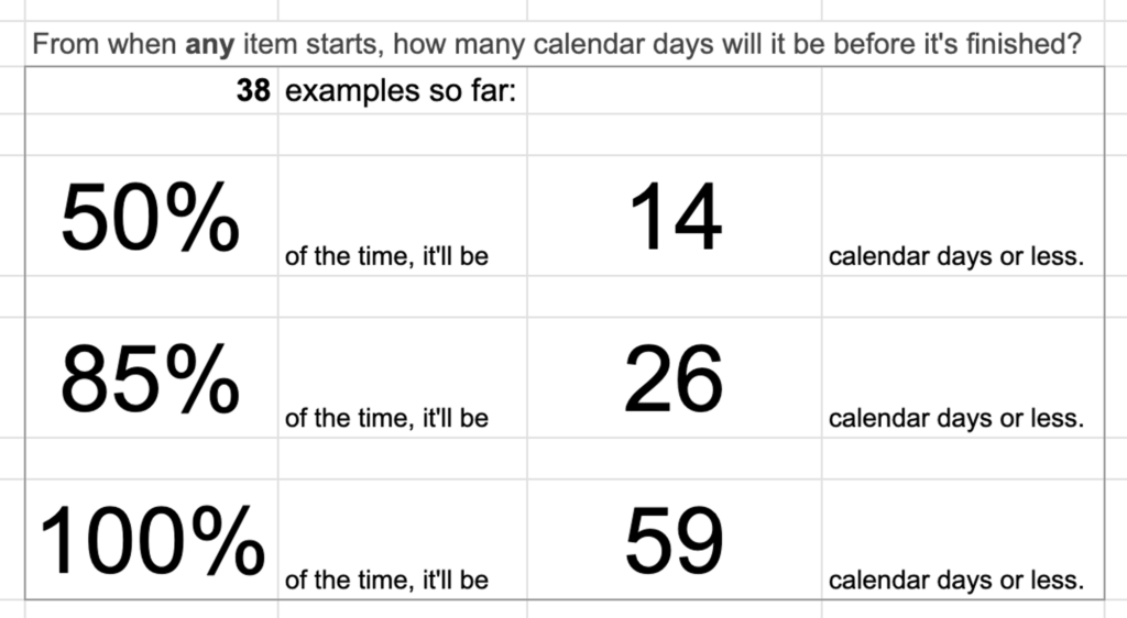
These percentiles (”50% of items took x days or less”) are a bit more useful than taking the mean (average), because they don’t get much affected by outliers (particularly the occasional really-long-running items that can drag the average up lots). To calculate the 50% value, you can picture it as lining up the cycle times for your items in order, from smallest to largest, and then throwing the top 50% of the items away. The highest value you have left lets you see that for 50% of the items you’ve done, they got from start to finish in that time or quicker. That’s useful to know!
To get more confidence (and maybe make predictions and plans), you can look at higher percentiles. The 85% cycle time is often used as a “Most of the time, ignoring those rarer really-long-running-ones” value. Put all the items you have so far in ascending order of cycle times, throw the top 15% of items away, and the top item that’s left lets you say that “85% of the time, items get from start to finish in this time or quicker”.
These values are for any item you’ve seen so far; the table below that one slices the data to just show this information for items you tagged as Small. You can add extra tables for other sizes (and might find you don’t gain much insight from the effort of sizing them), or for any other types of tag you put on your items.
These confidence levels and data-based observations give insights when looking to understand and improve how work flows through your team.
Scatterplots
There are lots of useful visualisations in the video and book I’ve linked to earlier. The spreadsheet includes one example: the cycle time scatterplot.
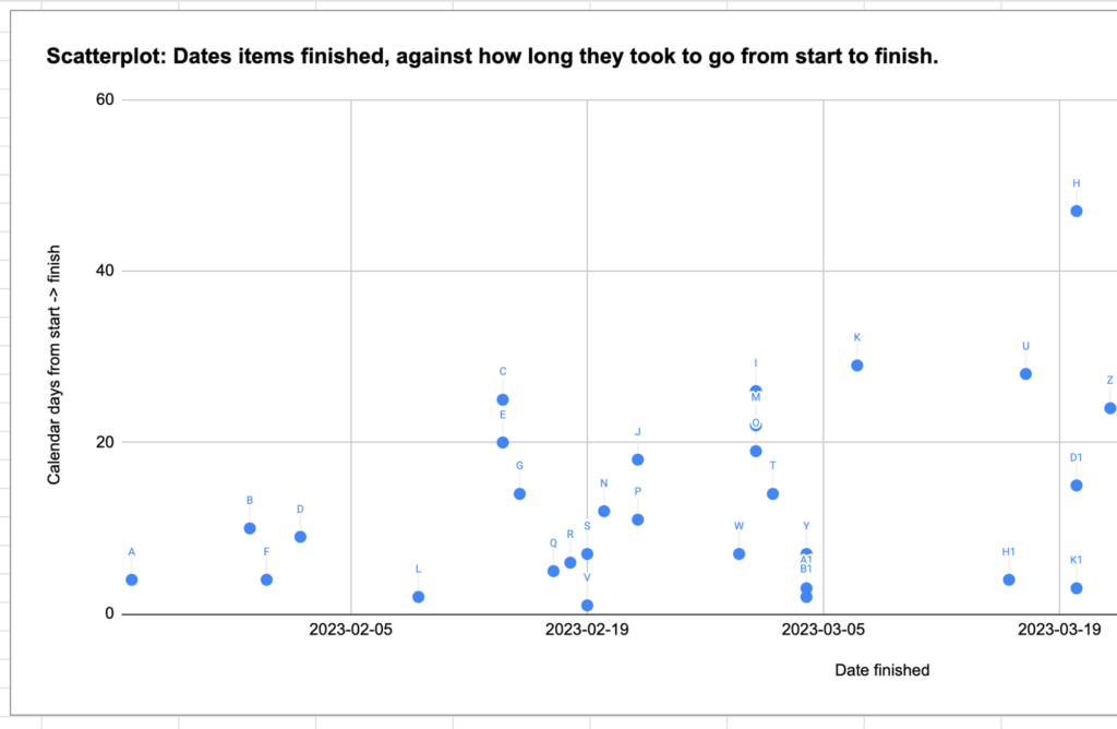
This shows your work items completing over time – they appear above the date they were finished (along the x-axis), positioned at a height matching their start-to-finish cycle time (up the y-axis). You can spot all kinds of patterns in a plot like this, prompting you to investigate what’s going on.
You might see things like dots spreading higher and higher over time (packing more Work In Progress in, and slowing everything down?), occasional items way, way higher than others (what do they have in common?), and other patterns. I’ve been prompted to investigate all kinds of things that I hadn’t considered before seeing charts like this.
Throughput
The last sheet looks at throughput: the amount of Work In Progress (number of work items) completed per unit of time. The sheet’s showing items per month – as with lots of other choices, you can use a month too, or whatever unit you think might be useful. And you can change your mind later if you like.
This is useful for planning and forecasting; if you have a release, demo, or other landmark coming up, it’s helpful to know that recently you’ve been completing “x items per month”, check how consistent that is with percentiles, and expect the near future to be similar to the recent past unless there’s a good reason to change that.
The percentiles can be used to check your ambition: If you’ve never completed more than 10 items in a month, and 50% of the time you only complete 3 or fewer items, you might want to rethink the “25-item todo list” you were making for this month.
And more
This post and linked spreadsheet are a starting point – I hope you find them helpful. You might like to expand the sheet with other charts and calculations as you work out how to do them. Or, if you’re looking for other resources:
- Dan Vacanti’s ActionableAgile Analytics software (demo) has a much wider range of interactive visualisations, and can plug into various work management tools – there’s a free trial you can test it out with.
- The FocusedObjective.Resources collection from Troy Magennis has lots of spreadsheets and tools for working with all kinds of team metrics – take a look around, you might spot something that helps with a challenge you’re looking at.
Next in this series
In part 2 I described times where I’ve found these metrics to be perfect for the kind of forecasting I needed to do, and some where they weren’t quite the right fit. In part 4 and part 5 I’ll try giving some ideas you can use when you’re in one of those “these techniques won’t work so well for my situation” cases. Finally, part 6 will give some general ideas to help you get the most out of estimation, while putting the least time and effort into it.