In part 1, I set the scene for this series, but didn’t get as far as ticking off any of the 10 things – let’s see if we can make more progress this time…
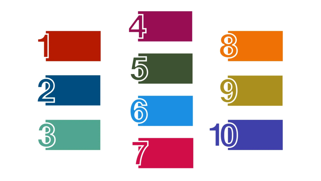
I’m interested in the OKR origin story. They were made famous by John Doerr, an investor and venture capitalist who brought them to lots of tech companies. Lots of the companies have talked publicly about using OKRs and said they were useful, leading to even more companies adopting them. In 2017 he wrote a book, “Measure what matters”, about his experience with OKRs and how to use them well – sounds like a good place to start.
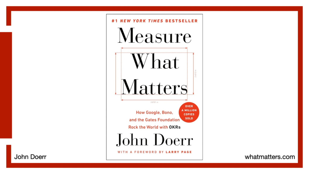
The book explains that John Doerr didn’t invent OKRs – he learned the approach while working at Intel in the 1970s, where CEO Andy Grove used them (Andy’s own book, High output management, talks a bit about them too). Intel set Objectives that had Key Results, but I think they were described there as Intel’s way of doing “management by objectives” (a much older idea) rather than using the now-famous acronym.
Measure what matters describes an early use of OKRs: in 1979, Intel became aware of a threat to its core business from Motorola. This competitor was offering similarly-powered chips at a lower price, and a field sales engineer told his manager that more and more companies were taking an interest in switching. This got relayed up to top management, who realised they’d missed this growing potential problem.
The issue got mentioned in December, and within 2 weeks a new company-wide set of objectives had been agreed and communicated across the whole 2000-person organisation. Intel had an entirely new plan to position itself in the market – telling a story about how choosing the right chipset to invest in is a critical decision, one you’ll be tied to for years to come, so you want one that’ll grow in the future, has extensive support for building on, and more. All the details would need to be worked out, but the high-level objectives, and specific key results that needed to be met, were agreed and getting worked on in that first 2-week period. This was all during the mid-December run up to end of year holidays, when most big companies would struggle to do any rapid changes.
A major thing that stood out for me about the OKRs here:

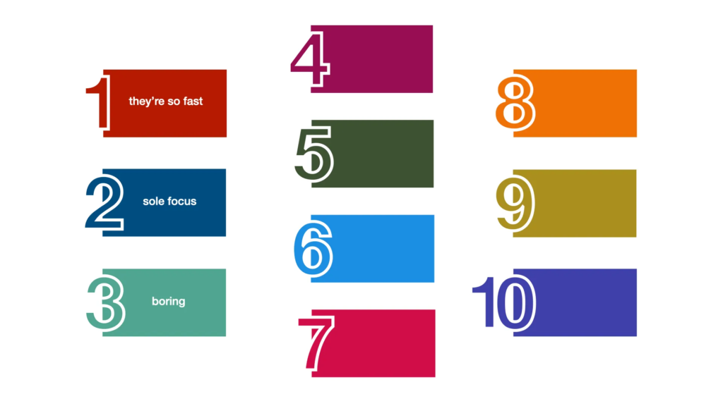
They’re so fast! This was echoed by Motorola at the time, who were stunned – the book has a quote from a Motorola manager: “I couldn’t get a plane ticket from Chicago to Arizona approved in the time you took to launch your campaign.”
Is that sentiment something you tend to associate with OKRs? In lots of people’s experience, there’s a long process of meetings, looking at options, discussing the wording, gathering the data, that can drag on for ages. The idea that OKRs can be a tool for rapidly agreeing clear direction, and communicating that when it’s urgent for everyone to act on it, feels like a surprise. Is it that aspect, rather than the format and wording, that made them an import part of Intel’s success? And is that something that lots of other companies might be missing out on?
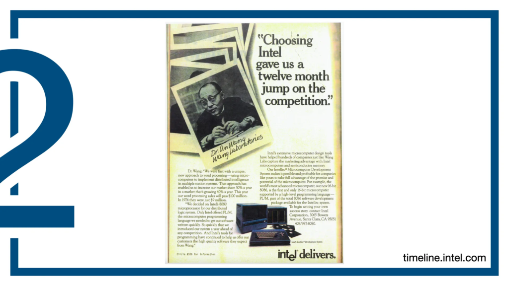
Intel’s interactive timeline lets you see adverts from this “Operation Crush” initiative – you can see how there would have been work for lots of departments in the company, with processors to build, benchmarks to develop and publish, marketing and sales collateral to make, and more.
The initial idea had come from a customer-facing role – that field sales engineer who’d spotted the challenge – and, after the high-level objectives were agreed, lots of the detail of exactly what needed to be done and what the more detailed objectives for different areas should be involved lots of “ground up” contributions. Work started on the new initiative straight away, but it took several months to coordinate exactly who needed to do what things.
Some months into 1980, around half of the 2000-person company was working towards this overall objective as their main job – and the other half of the company understood that as soon as it became clear something for it was needed from them, they should switch from whatever else they were doing and help with it too. This feels like a real story of a whole company pulling in the same direction.

As with the speed mentioned as that first “thing”, this sole focus for thousands of people doesn’t feel like something I’ve seen associate with OKRs in many places. Rather than “what’s one thing this company urgently wants to achieve, and how can you help,” the exercise is more “what’s this team going to focus on, and what’s that team’s focus, and does everyone have an objective? Oh, let’s make sure this team gets one”.
Rather than that flexibility to work out how people can organise around the wide objective, and be able to drop things to help when an opportunity becomes clear, more often it feels like each team gets its own focus to stick to. These might be coordinated to add up to one aim, but that’s done as carefully-planned initial OKR setup.
The book also has a few of the actual OKRs from that time:
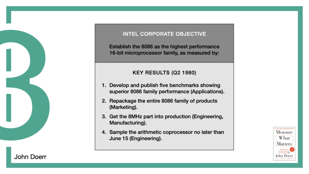
The top-level, whole-company objective. See the key results? Publish five benchmarks, get the new 8MHz (blazingly fast!) part into production.
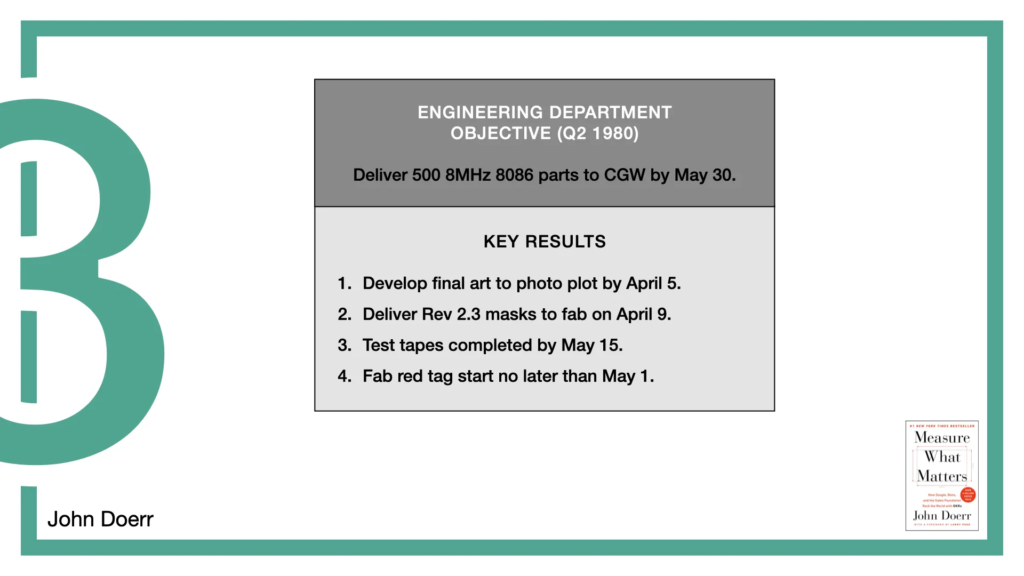
And here’s an example for one department (engineering), that describes their main contribution to that overall objective. Final art by April 5, test tapes by May 1.
You know what stands out to me as I read through these?

They’re boring! I don’t mean to be insulting – these are the OKRs for a hugely successful company, and I really believe they helped – but that’s the word that came to mind as I read them!
I think that’s in response to the advice we often get about OKRs – to make the objective inspirational, based on outcomes, the key results a measure of real business impact and meeting user needs. Again and again I’ve read and heard that helping you focus on those – moving away from box-ticking and outputs – is an essential part of what makes OKRs successful.
The Measure what matters book has similarly prosaic, project-plan-style OKRs in lots of other examples and case studies. Some reviewers have disliked it because of that, feeling these are poor examples of what good OKRs look like. They may be right – maybe you can get much more out of OKRs if you use them to help focus on impact, not activities – but I think knowing what John Doerr put up as examples is important.
A big selling point for OKRs is “OKRs these were used by these hugely successful companies, and those companies say OKRs were a vital part of their success. Here’s what OKRs are.” If the companies that had such success with them managed that despite their OKRs being “boring”, I want to know about it.
It may be that we can get even better value from OKRs when we do pay attention to the outcomes and impact – but like the other parts of this origin story, I think knowing how they’ve really been used in the past is helpful when looking at how we can make them successful today.
Next time
We’ve made much better progress here than in part 1: 3 things completed, a vast improvement over the 0 in that first post.
Next post, part 3, will move out of 1980s and John Doerr’s book and take a look at what some other companies have been up to with OKRs. Then part 4 will move on to some more general pitfalls I’ve seen.
Comments
One response to “10 things nobody tells you about OKRs, part 2”
[…] 10 things nobody tells you about OKRs, part 2 […]